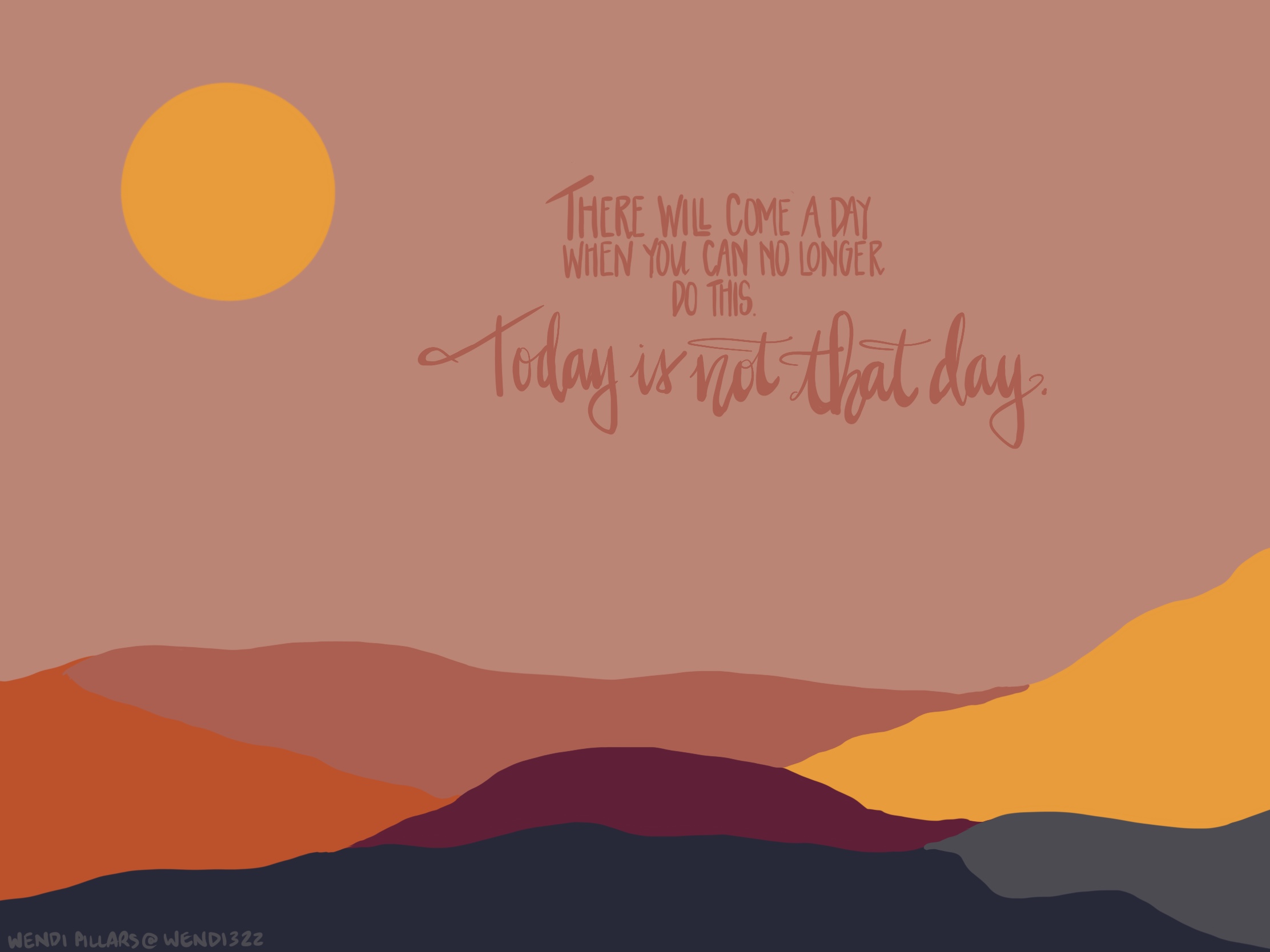
This saying is one that is taped inside my medicine cabinet so that I see it every single day. It’s been there for years, and has stood the test of time. Although it has been powerful in its typed form, imagining thoughts and words with color is what my brain does. Lately I’ve been playing with different color palettes, and this mash-up evokes different things for me.
Now, I’m no chemistry major, but I do know that color changes occur from chemical changes. I also understand that some sort of energy gain or release occurs with chemical changes, and for me, that’s evidence of just how powerful color can be when we view it. Colors have the power to shift our mood, can evoke strong like or dislike and can draw us toward or away from something.
I’m sure you’ve read about prisons painting their walls pink in an attempt to tamp down prisoner aggression, or the influence of Pantone’s Color of the Year, and can tell a brand name simply by its colors. There is power in color, even a field of study called color psychology, and marketers know this. Use red to spark appetite, create a sense of urgency or display power. Greens to calm, soothe, and think more “earthy”. Blues for water, tranquility, peace, and reliability. Oranges or yellows for excitement, happiness, and vitality. Hues of black or gray for wisdom, intelligence, confidence and strength…all of these within moderation, of course.
Of course there are flip sides to any color. Too much blue or even gray, for example, can nudge moods into a darker, depressive side. Other colors may be associated with a particular gender, or be incongruent with the tone of your messaging. Think not only of your logo, but signage, your website theme, advertising, swag, office organization, product displays and more. According to the Psychology of Color in Marketing, 93% of buyers focus on the visual appearance, and in today’s digital economy, I’m willing to wager that means exponentially moreso for the appearance of your website, social media feeds and online business.
Start with two or three colors. They’re easier to remember than an entire rainbow of hues and two colors are easier to contrast or play with in tandem. Try a darker color and another to make it pop. Be bold. Be daring.
Simply, be creative. You have permission to play.
What story are the colors of your business telling? How do they align with your vision?
What tired “text” can you revamp with evocative, mood-shaping colors to entice your buyers, your audiences, your followers?
How can I help? Let’s get started rethinking the power of visuals in your world.
